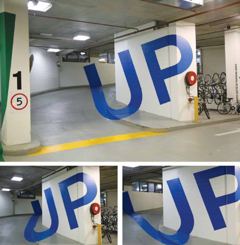
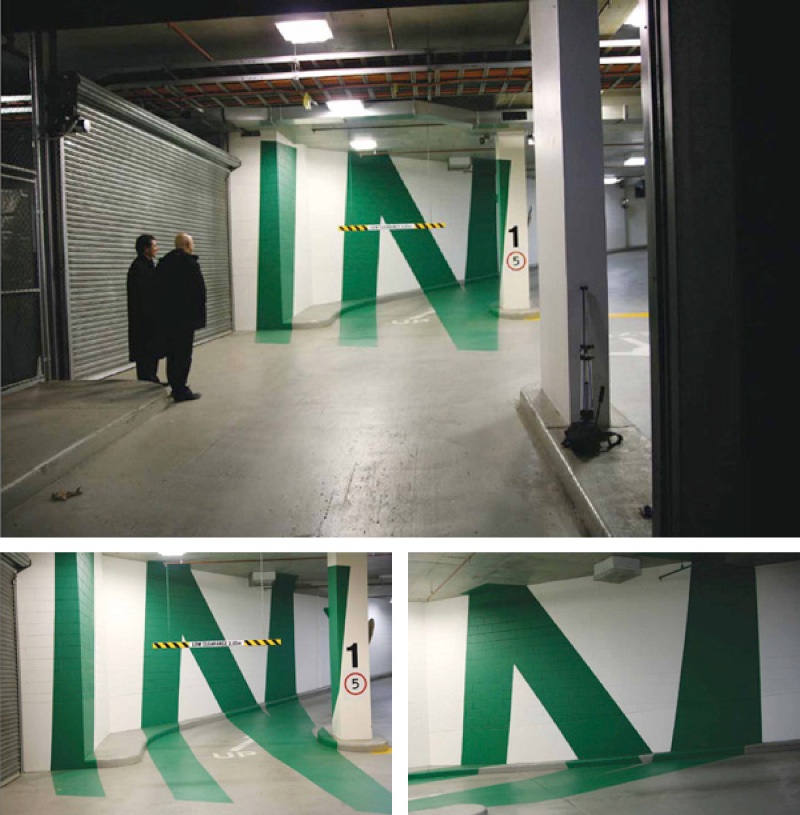
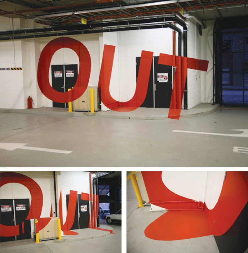
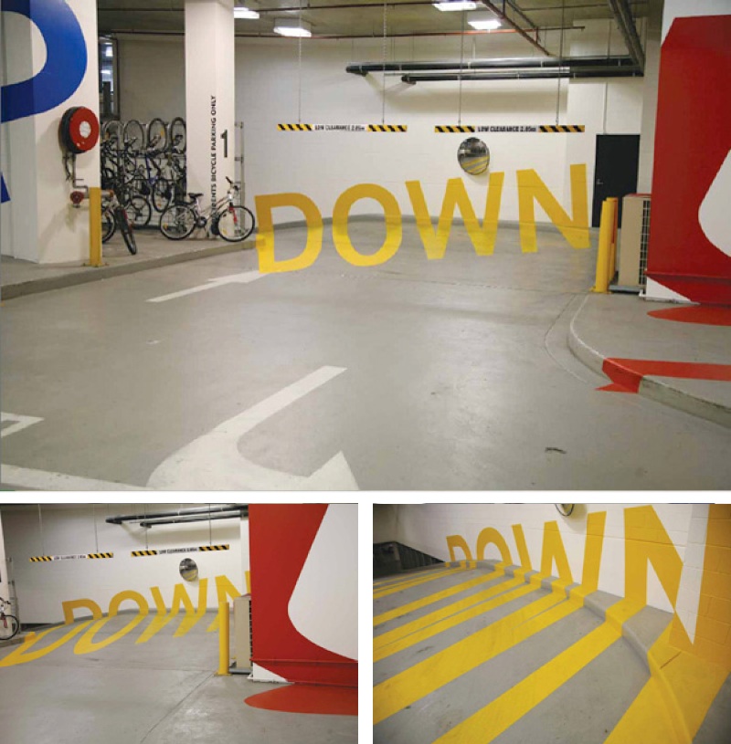
Very clever typography used at the Eureka Tower Carpark. Distorted letters were painted on the walls so that as you drive by, what seems to be just colorful lines spells out signs such as UP and Down. When in the right position, the letters seem to pop out of the walls. This project won several design awards. Click the link at the bottom to see more pictures!


Other Creativity Posts:
Creativity: Electrabel – Happy New Year – Candle Light
Creativity: Toshiba Timesculpture Advertisement Video
Creativity: Leave Nothing Nike Commercials

5 Comments
Very cool! I like the use of forced perspective. The non-distorted words look almost as if they’ve been Photoshopped into the image.
Not to shabby.
Im trully inspired by the simplicity and effect of this marvelous peice of work. I would love to go see it one day, does anybody know where the Eureka Tower Carpark is?
Many thanks,
Tom.
I believe this incredible typography is in the Eureka Tower Car Park located in Melbourne Australia. The Tower is located in the South Bank suburb of Port Philip, Melbourne, Australia. The Eureka Tower is the world’s tallest residential tower and Australia’s tallest building. Unless there is more than one Eureka Tower, i believe this one is it.
Thanks for the comments!
Nice Job Crazy!!!